Very often the vast range of choices available can appear overwhelming – and the most obvious problem is where to start? I’ve created this simple guide to do just that, get you started. Framing is almost always a series of sensitive decisions, with a single simple goal in mind.
Framing has one essential job: to create a visual boundary between the artwork and the space it lives in. Sounds simple, right? But doing that while also complementing the artwork in style, tone, finish, and feel? That’s where things get more complex – so to keep things simple I’ve started with context, the things I have in mind when I start to think about framing in general, and then the specifics of particular framing schemes for a particular artwork.
The art comes first. Your framing design should enhance, not compete with the piece you’re framing. It’s tempting to choose something that matches your décor, but always start with the artwork itself. A frame that complements the colour, tone, texture, and feel of the piece will always look timeless – no matter what changes in your home.
Conservation materials. I only use conservation grade materials in my work – essentially this means that I aim to minimise any deterioration of the artwork by ensuring that the work is not in contact with anything that will prematurely age or damage it. For example acid-free mountboards, UV-protective glazing, and archival backing help protect the artwork from fading, yellowing, or deterioration. The goal is not just to make it look good – but to keep it that way for decades.
Environmental considerations. For some framers, and I’m one of them, minimising the impact on the environment of my work is a high priority. I choose mouldings wherever possible that are Forest Stewardship Council managed, and my other making materials, finishes, and packaging etc, from companies that have a strong environmental sourcing and ethical policy.
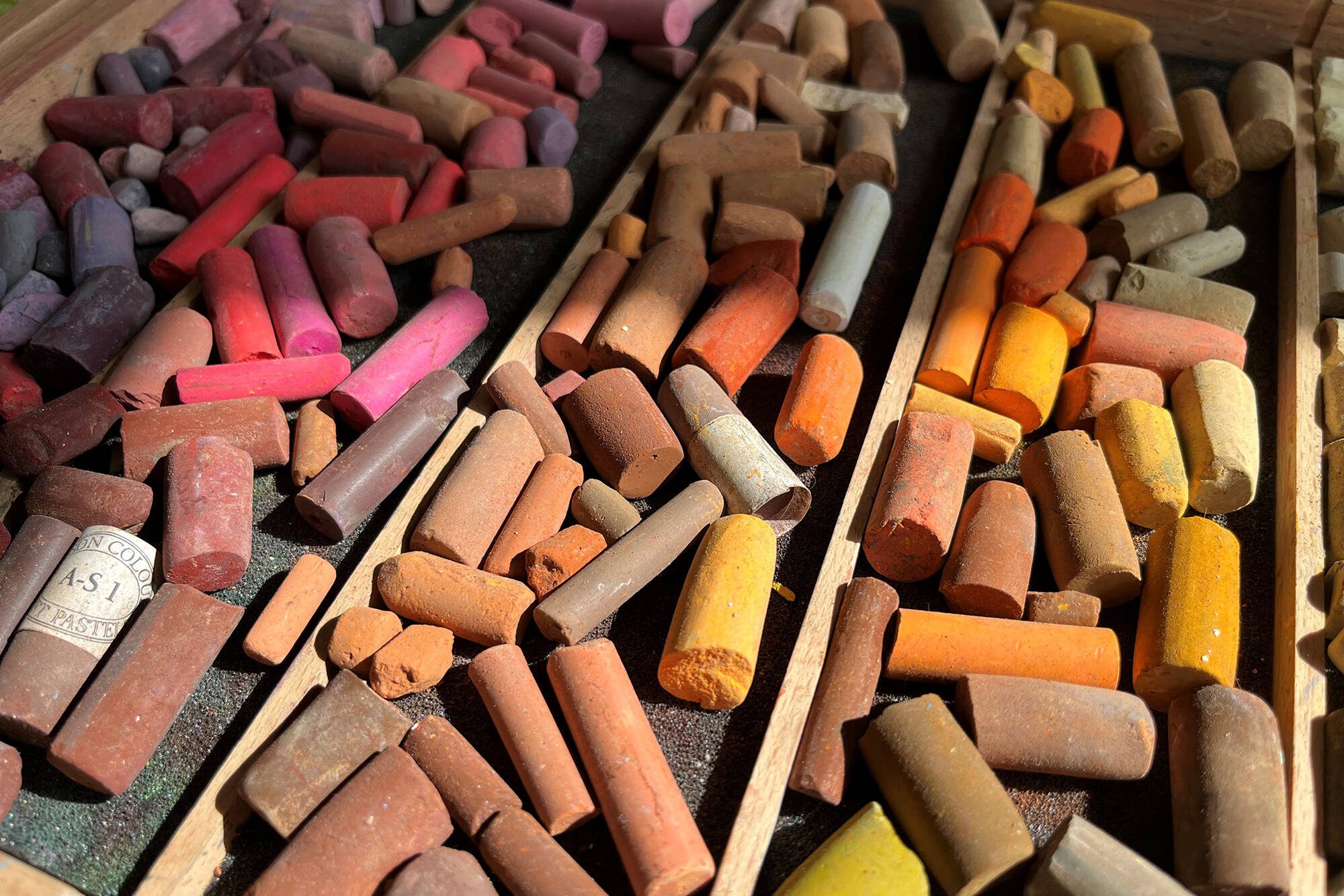
Mountboards are more than just a border. A mount (if required) serves multiple purposes: it visually frames the artwork, creating a breathing space and preventing direct contact with any glazing. It can significantly alter the emotional appeal of the artwork – making it feel more open, elevated, or dramatic – depending on how you use it. Choosing the right width and colour(s) is an art in itself, and when done right the aesthetic returns can be amazing.
Here’s a simplified guide to how I usually approach colour and finish selection for a piece. It’s a little of an oversimplification, but I think it’s a helpful starting point.
Start with the Artwork’s “Weight”One of the first things I consider is the visual and emotional weight of the piece.
- A delicate pencil sketch, etching, or fine line drawing tends to feel more at home in a simple wood-stained moulding. The goal is to avoid overpowering the artwork with framing that feels too heavy or elaborate.
- On the other hand, a bold or dramatic piece often needs a more substantial frame to hold its own. Perhaps a wider moulding with a carefully chosen finish – not necessarily loud, but strong and with a little power of its own, can create a harmonious balance and help the artwork rest confidently in the space.
Neutral Colours for Vibrant ArtIf your artwork is full of vibrant or varied colours, a neutral frame finish is often the safest and most elegant option. Think soft natural wood tones, greys, or subtle off-whites. These allow the artwork to remain the focus without creating visual competition.
Match, Complement, or Contrast?When your piece has a dominant colour, you have some options:
- Match it: Using a similar colour in the frame or mount can create a sense of cohesion.
- Complement it: Look to complementary colours on the colour wheel – this creates a pleasing, harmonious effect.
- Contrast it: Picking out a highlight or accent colour from the artwork can create a bold, dramatic statement.
Each option has its own impact – it really depends on the mood you want to evoke.
Don’t Forget the Space It Lives InFinally, and importantly, think about the environment where the framed piece will hang:
- Is the room traditional or modern?
- Are the furnishings cool-toned or warm-toned?
- Will the lighting be natural, warm, or artificial?
If you feel that the frame feels like a natural extension of both the artwork and the room it lives in, then you’ve got it about right.
In Summary
Choosing colours and finishes for your frame is part art, part science – and a lot about feeling. A well-chosen, hand-finished frame should quietly elevate your artwork while creating a seamless connection to the space around it. And one last thought, viewing art should feel like a conversation – some need an intimate breathless whisper, others a megaphone, and yet more somewhere in-between.
Why Hand-Finished Framing Offers More. Unlike standard, off-the-shelf mouldings, hand-finished frames offer a more creative and nuanced result – but in return they require a bit more from us in creating the perfect framing scheme. That’s why I offer a Free Framing Advisory Service, where we can explore your framing options together. You can access it [here].
Related Posts

Me, Myself & AI – Art in An Artificial Age
Sticky
Artificial Intelligence - is it just another over-hyped technology which once…
Imagine Yourself Creative – It’s Easier if You Believe.
When we think of what it takes to be creative, we often picture someone else.…
These are a few of my favourite (art) things – wrapped up in brown paper and string. Pt 1.
There’s something undeniably lovely about brown paper and string. Maybe it’s…

Impostor Syndrome and the Quiet Rebellion of Creativity
It's hard not to find yourself nodding in sympathy when you hear tales of…